Patient Intake Forms | Case Study
Overview
Problem: Transition physical kiosk check-in to a responsive web experience, integrating post-scheduling content including authentication, legal consents, insurance and payment details collection.
- Design boosted check-in and data collection conversion by 20%
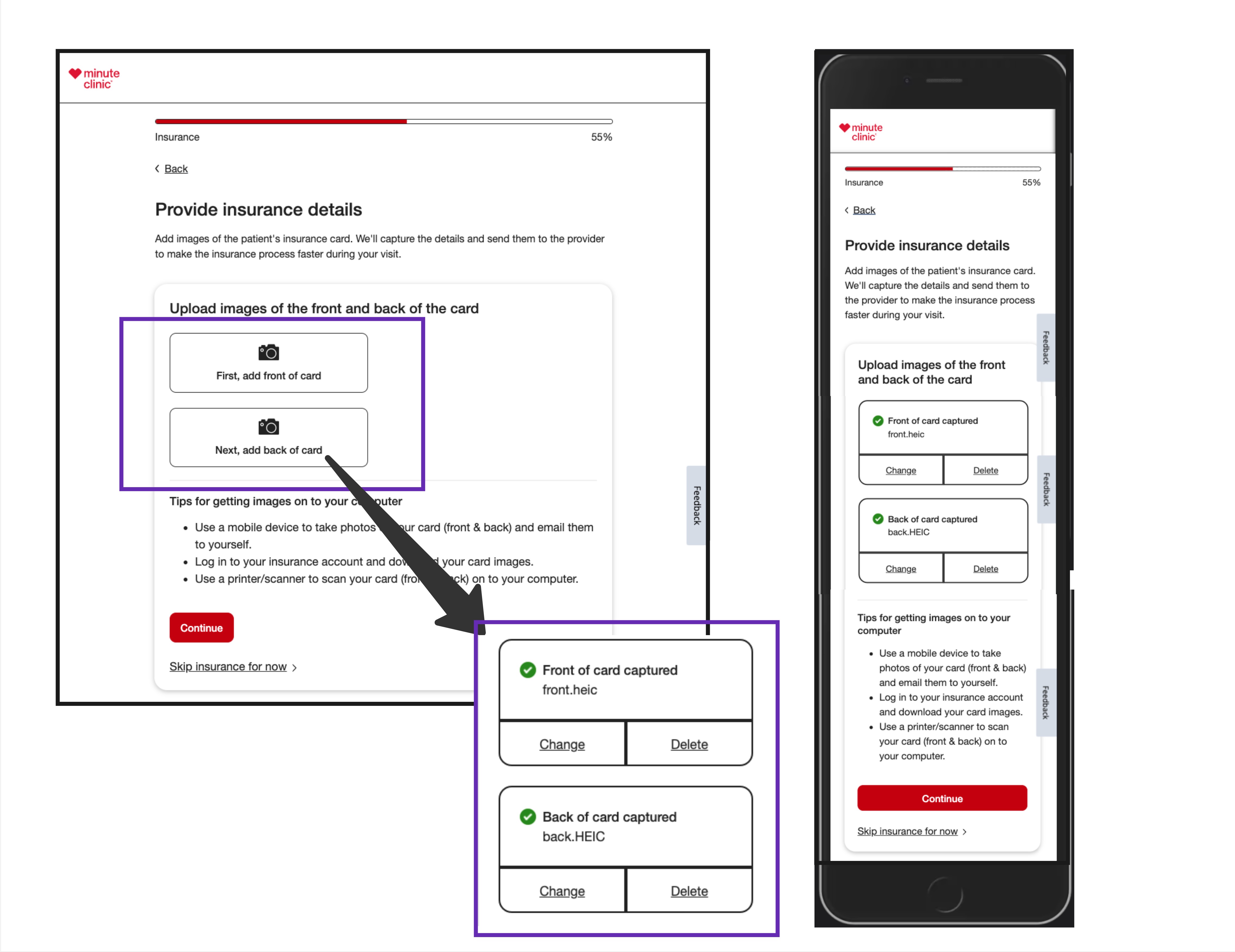
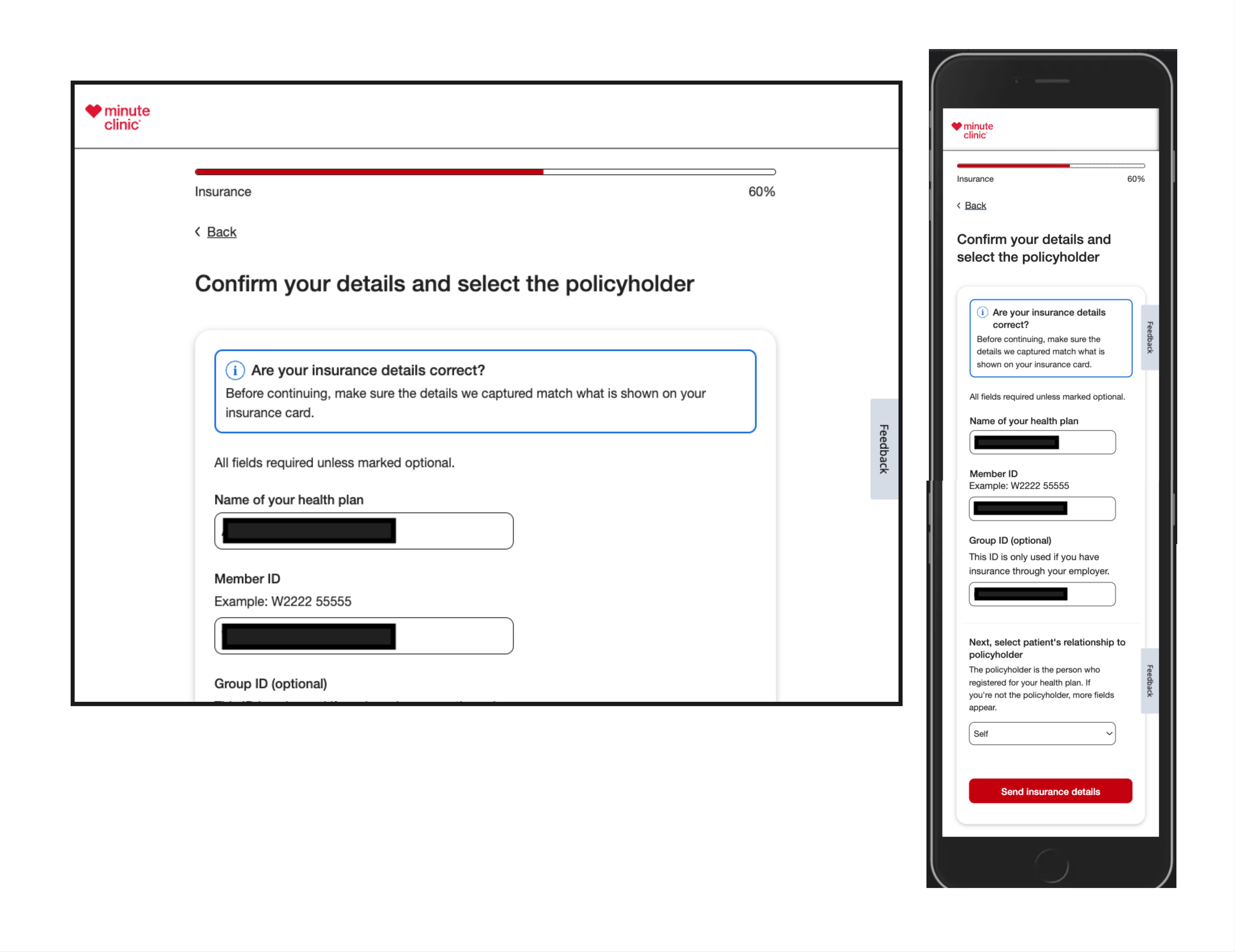
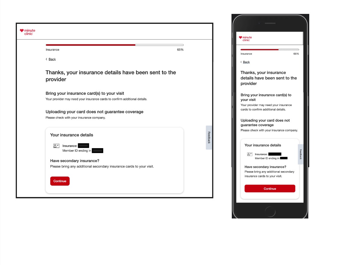
- Streamlined and improved accuracy of insurance data collection with use of Optical Character Recognition Conversion (OCR) from insurance card photos.
- Built trust with users desiring to use personal devices (phone or tablet) for more safe check-in experience during Covid health pandemic.
Requirements:
- Ensure New Design Meets (WCAG) 2.1 Level 'AA' Accessibility Guidelines.
- Provide A11y Design Support to all UX staff and development staff Supporting visit manager Design and implementation.
- Provide A11y Design Annotations with Design deliverables as a Handoff to the Development team for implementation.
Contributions:
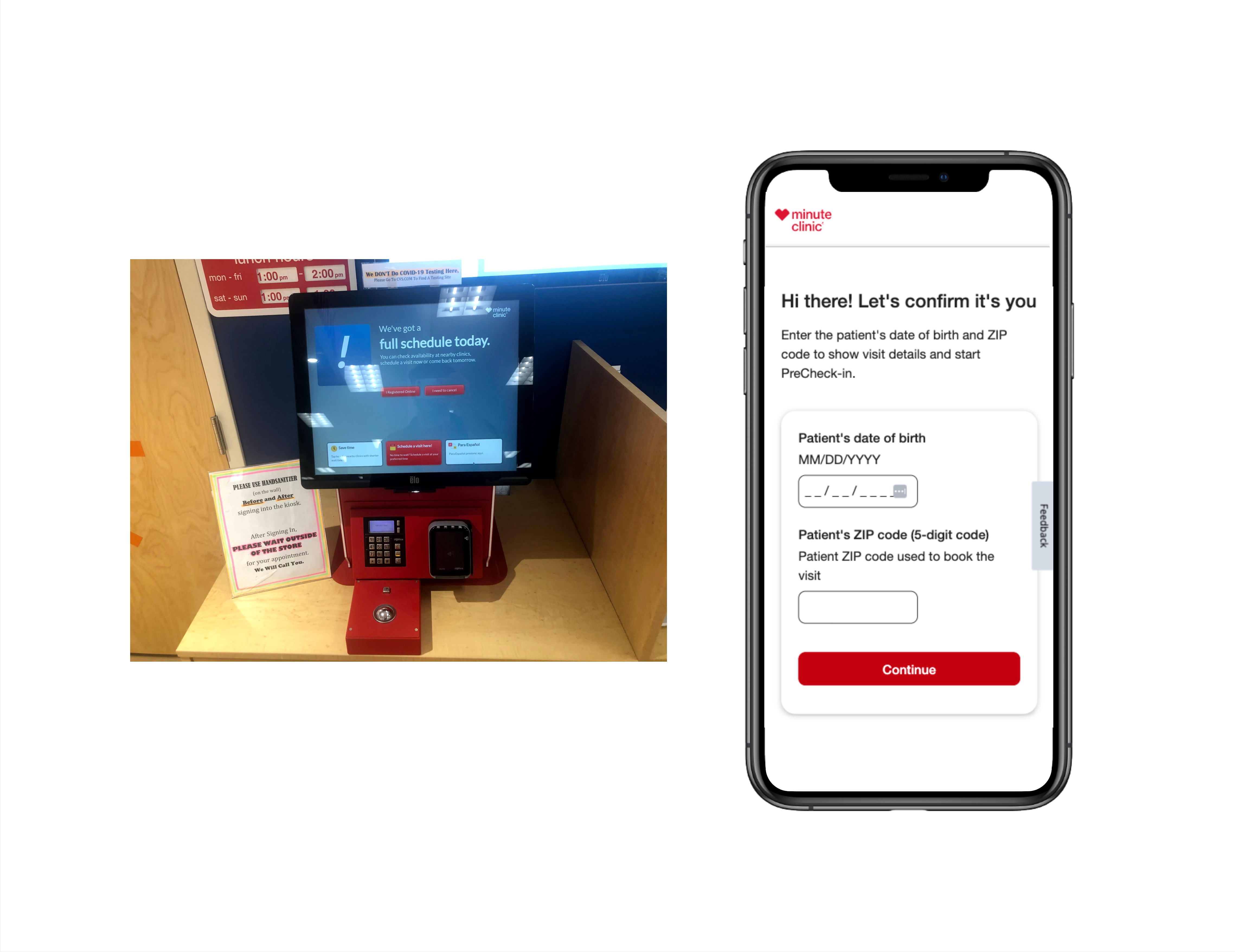
- Take inventory review all the screens and capabilities of the kiosk in the clinic
- Inperson Observation research
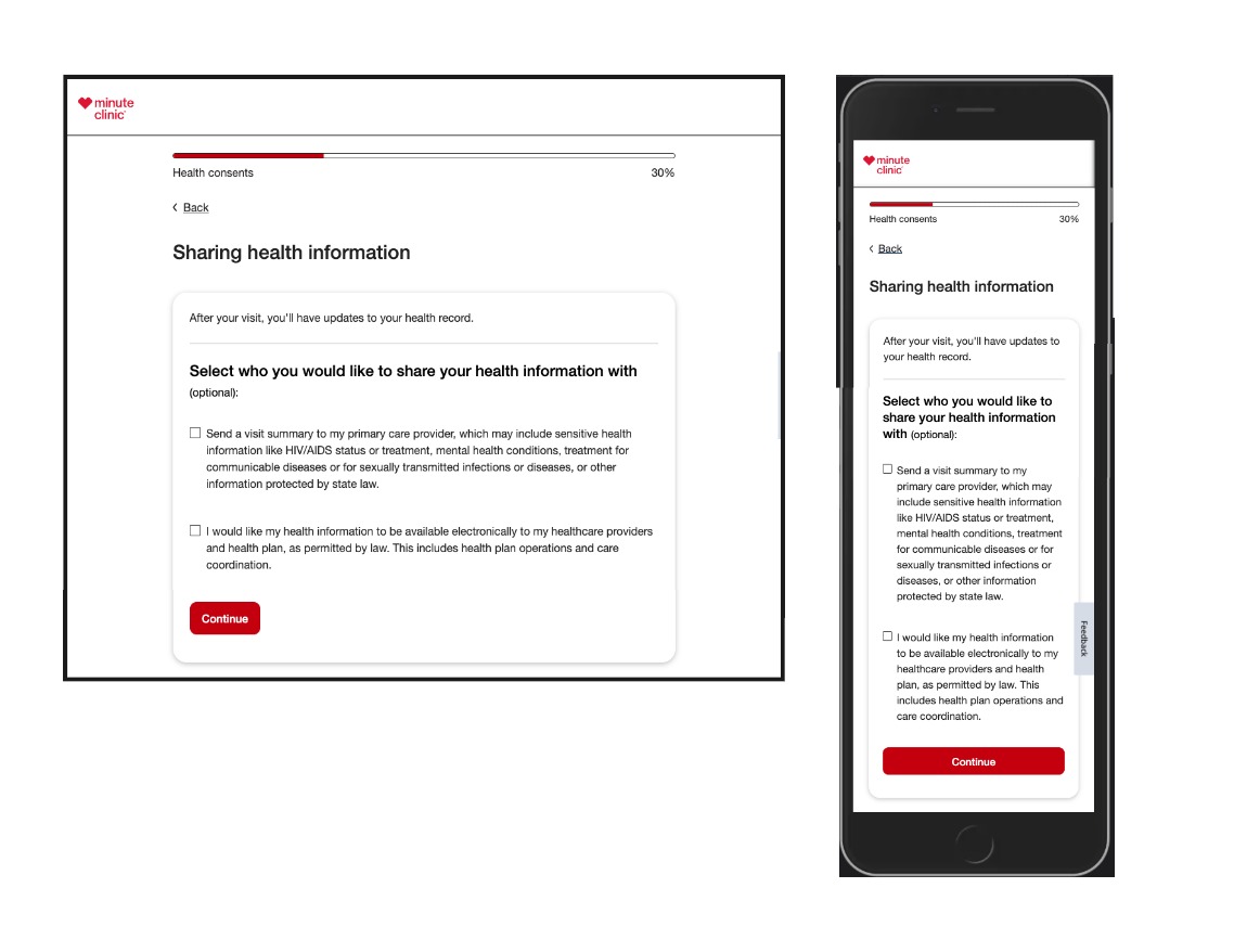
- Form Design focused on Ease of use and focus to ensure cognitive and low vision accessibility.
- Spotlight concerns and accessibility gaps missing from the kiosk experience in the clinic that the web app could alleviate
- Collaborate with UX team in a redesigning a digital flow for the experience
- Participate in design iterations of preparing users for the upcoming clinic visit
- Provide ux with Design discussions around common accessibility technology concerns with Designs and how to Support all users and avoid accessibility barriers.
Design Stage
Legacy Kiosk Experience & New Responsive Redesign


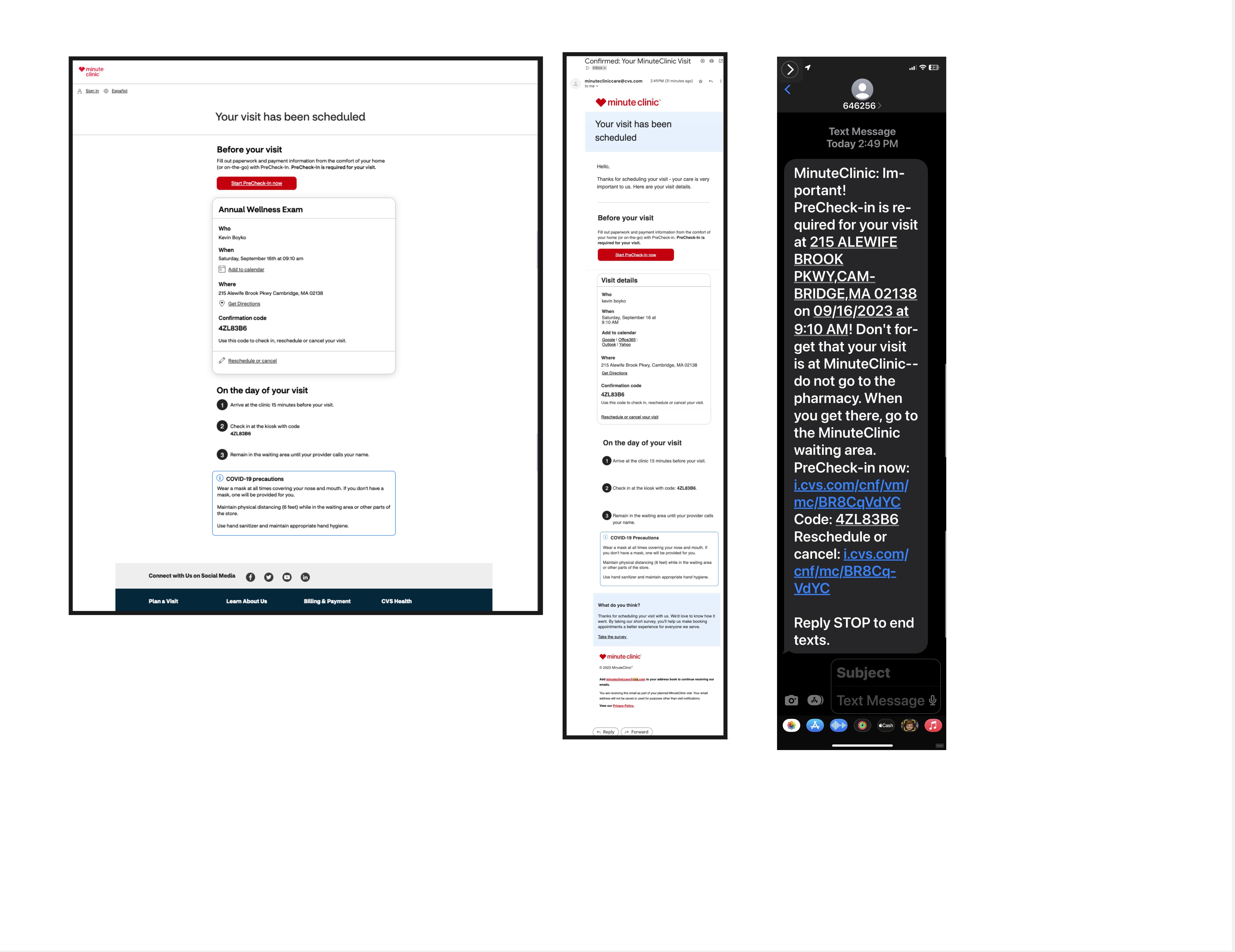
Clinc Visit Scheduled - Confirmation Page and Messages
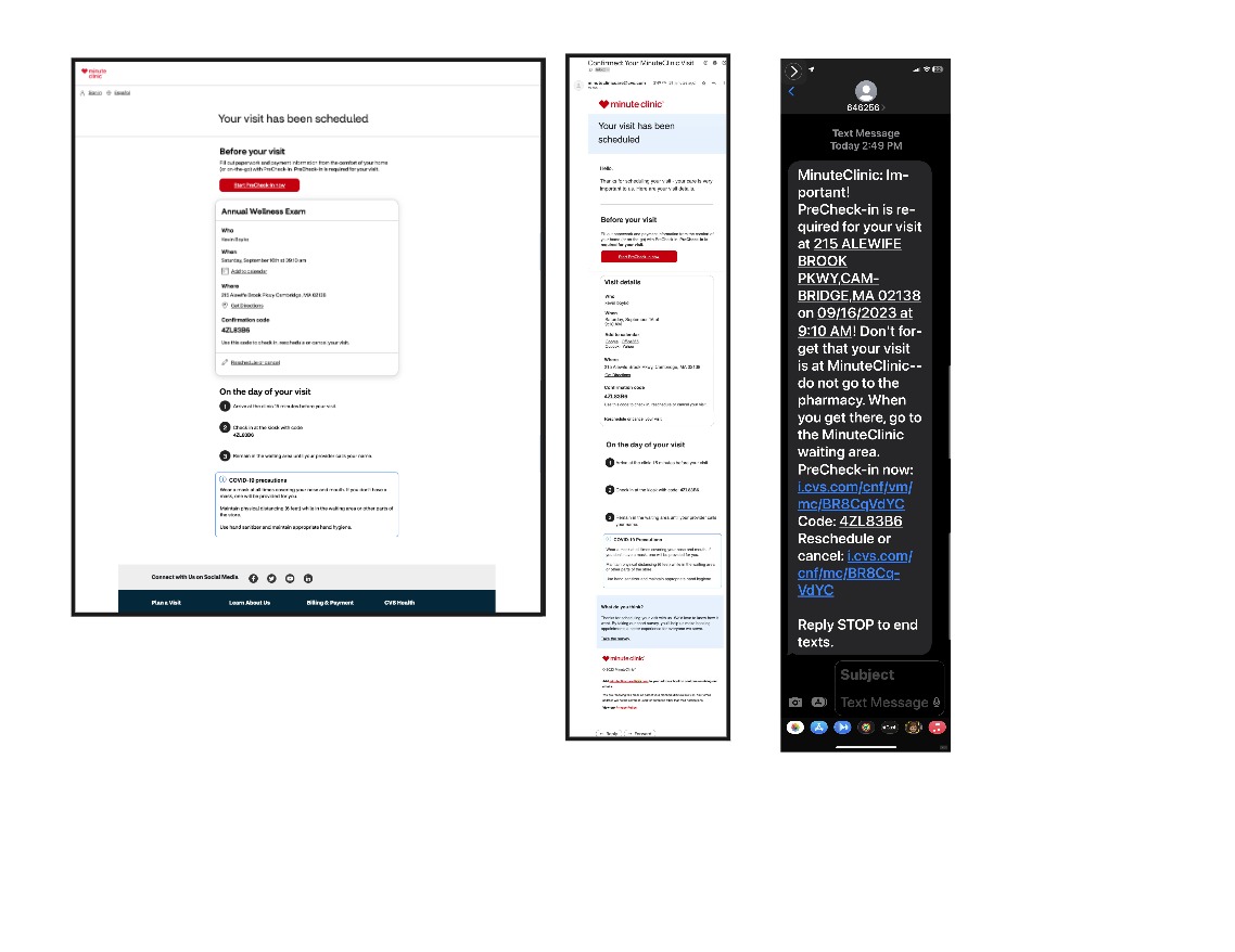
Clinc Visit Scheduled - Confirmation Email Design
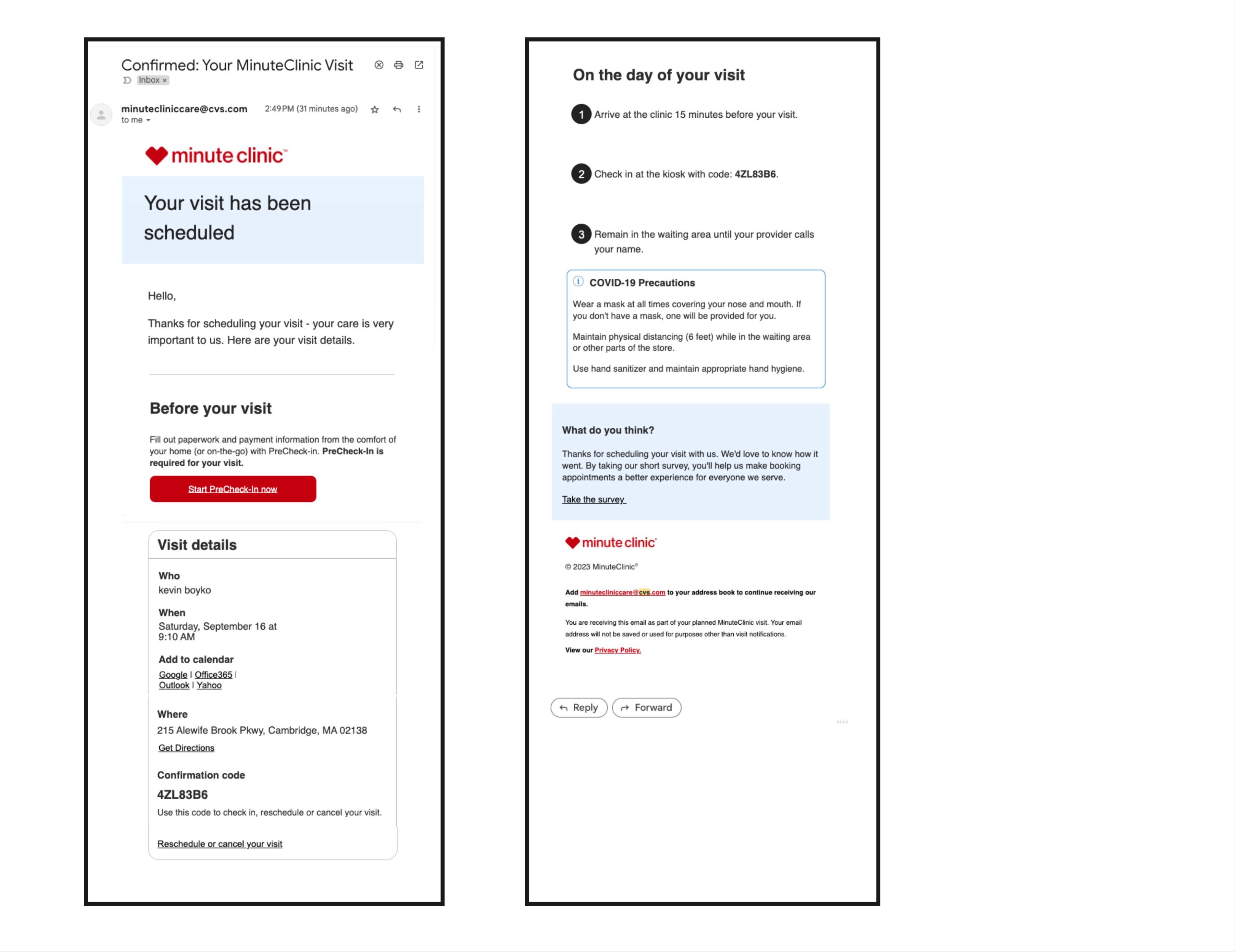

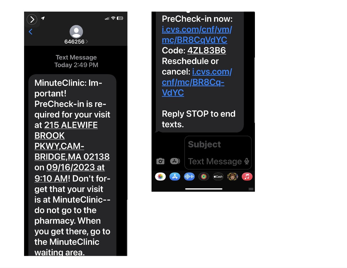
Clinic Visit Scheduled - PreCheck-in Required SMS Design

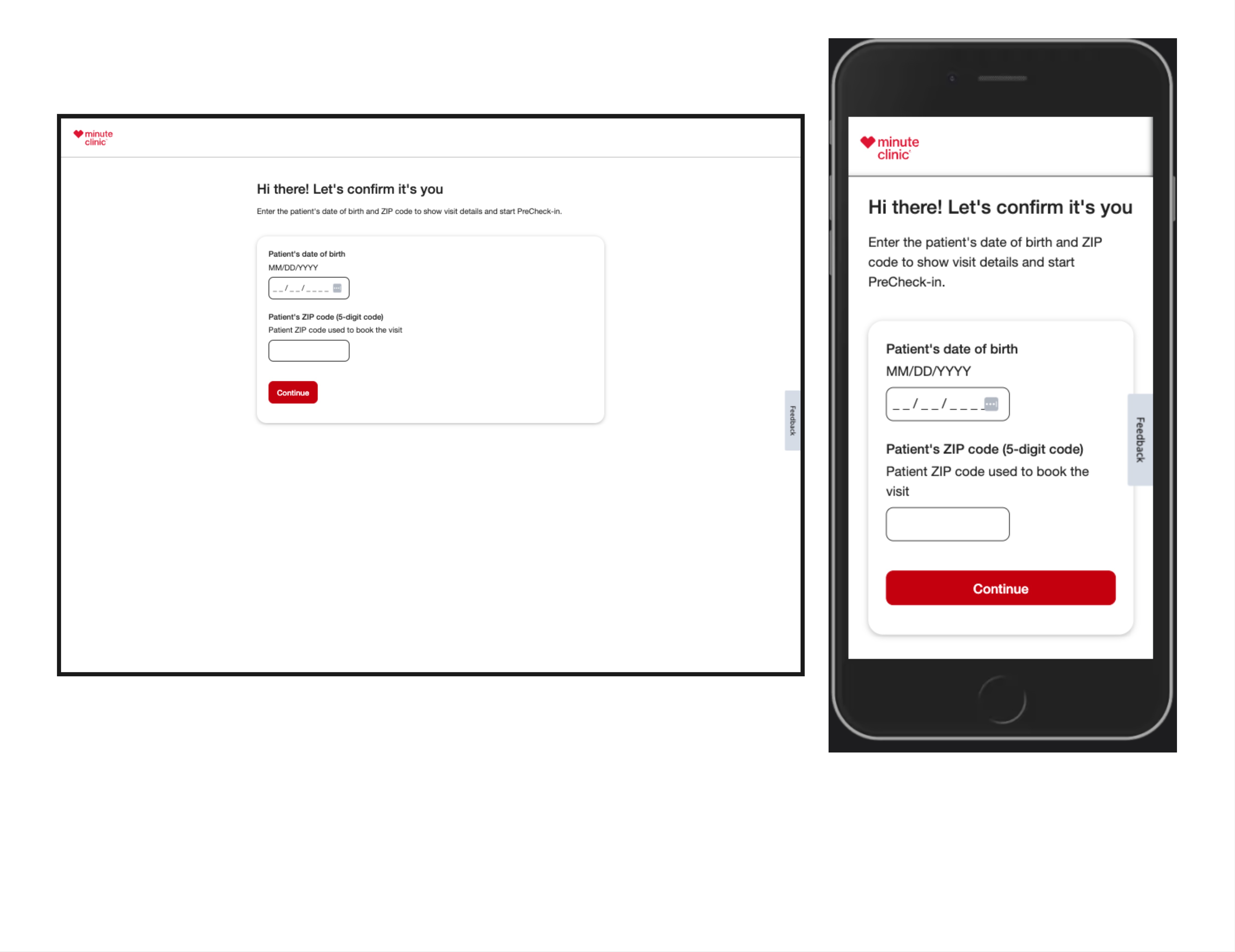
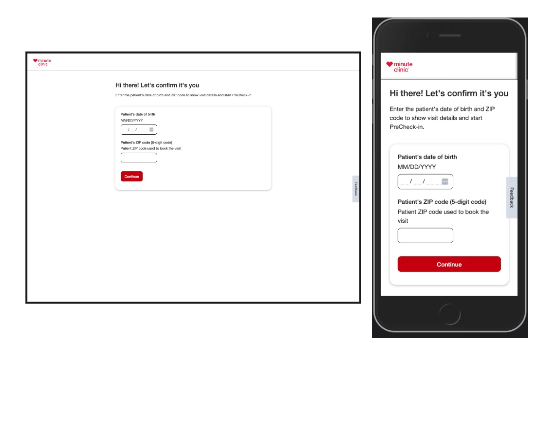
Visit Manager ( Visit Checkin & PreCheck-in) - Authentication
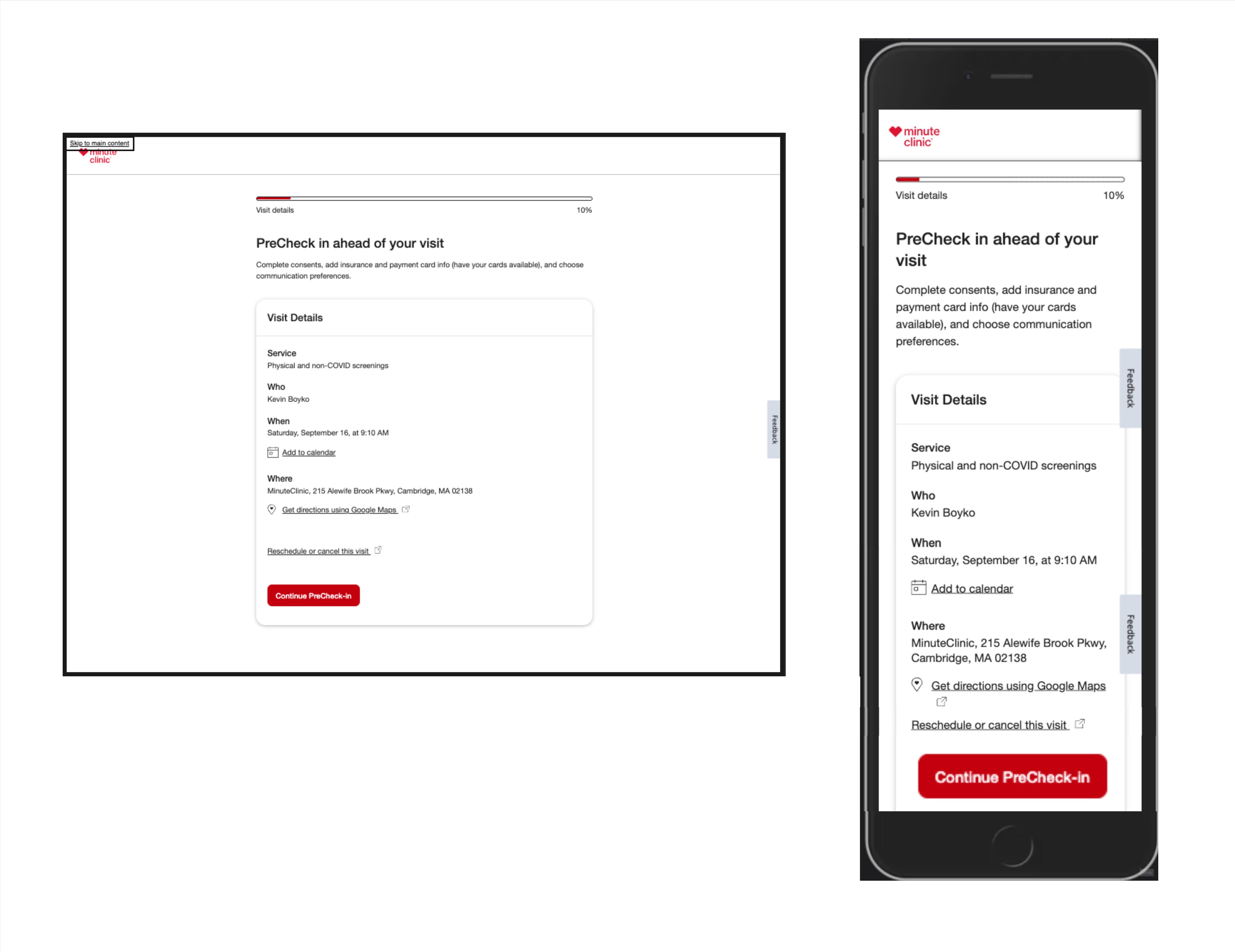
Start Precheck
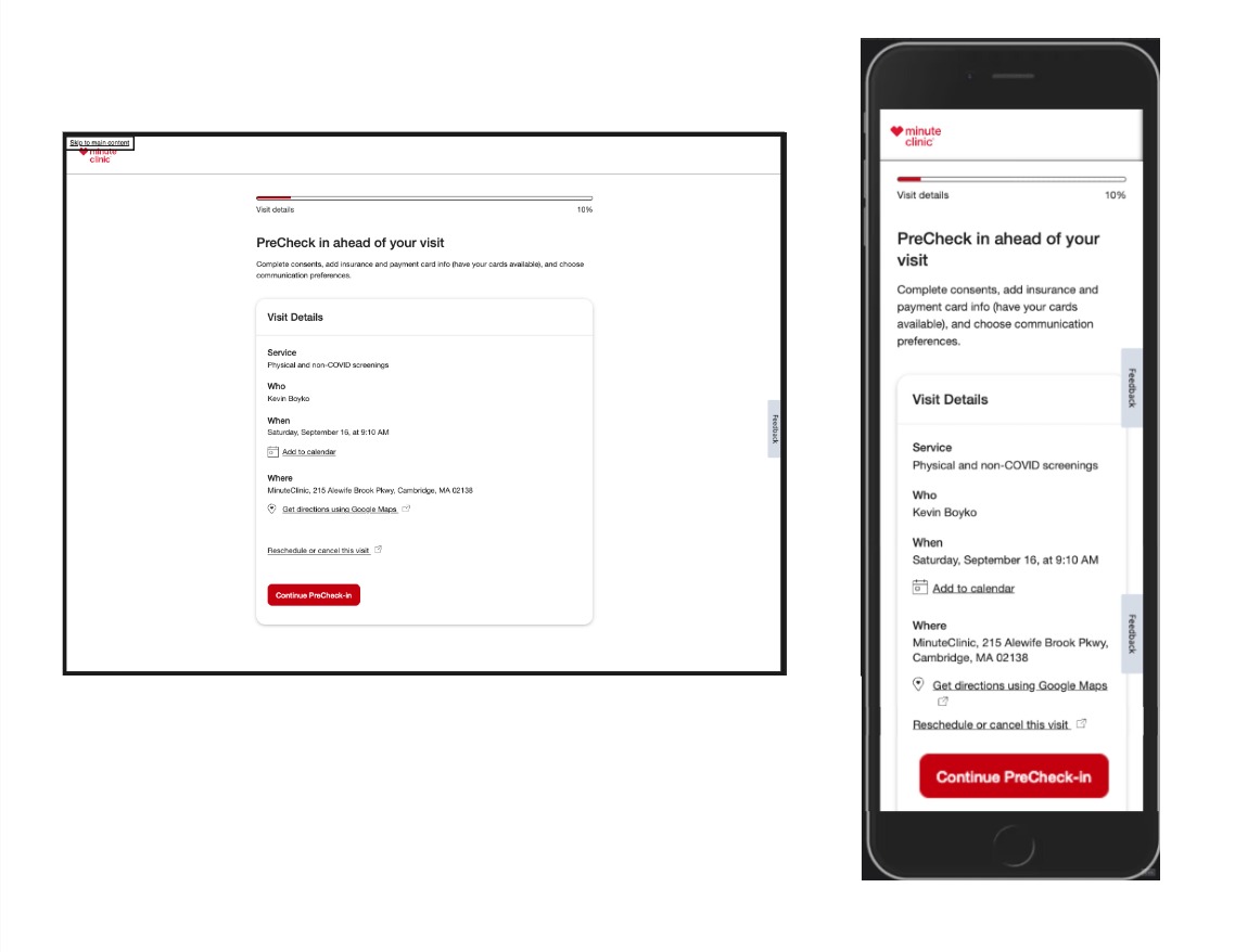
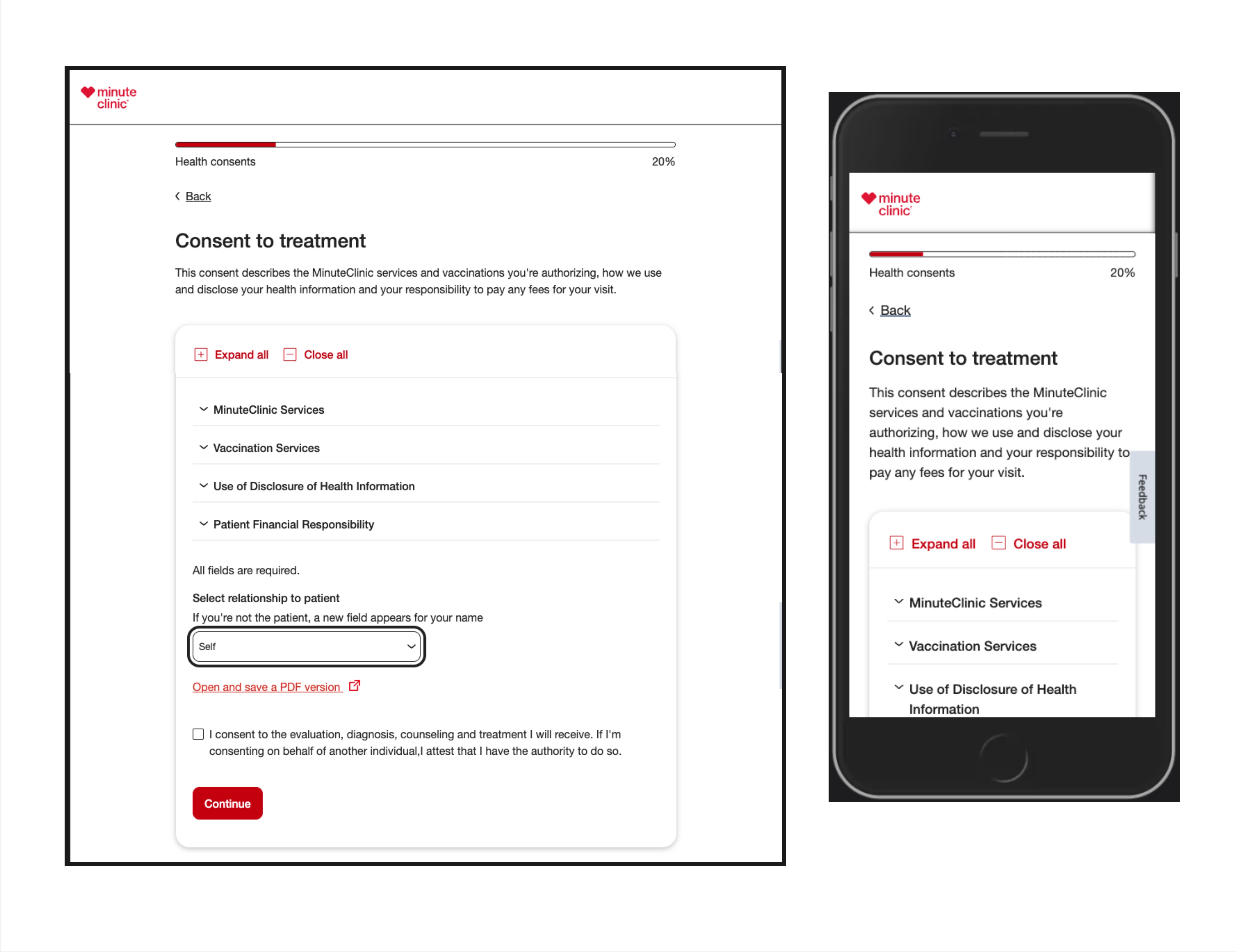
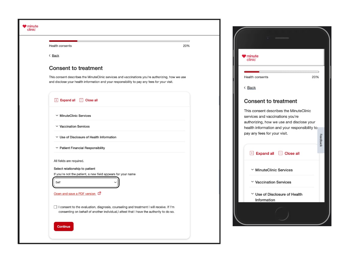
Consents to Treat & Share Info
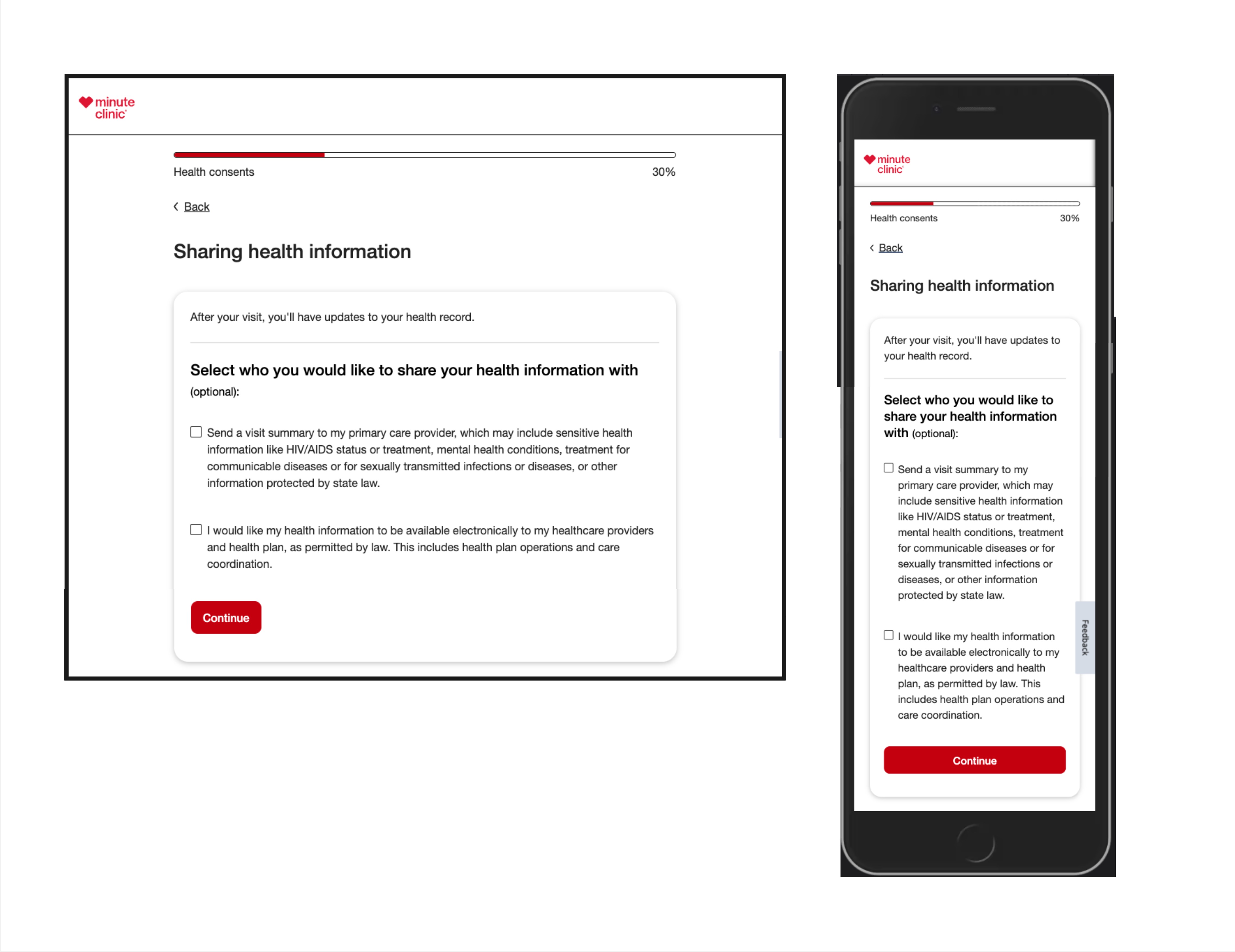
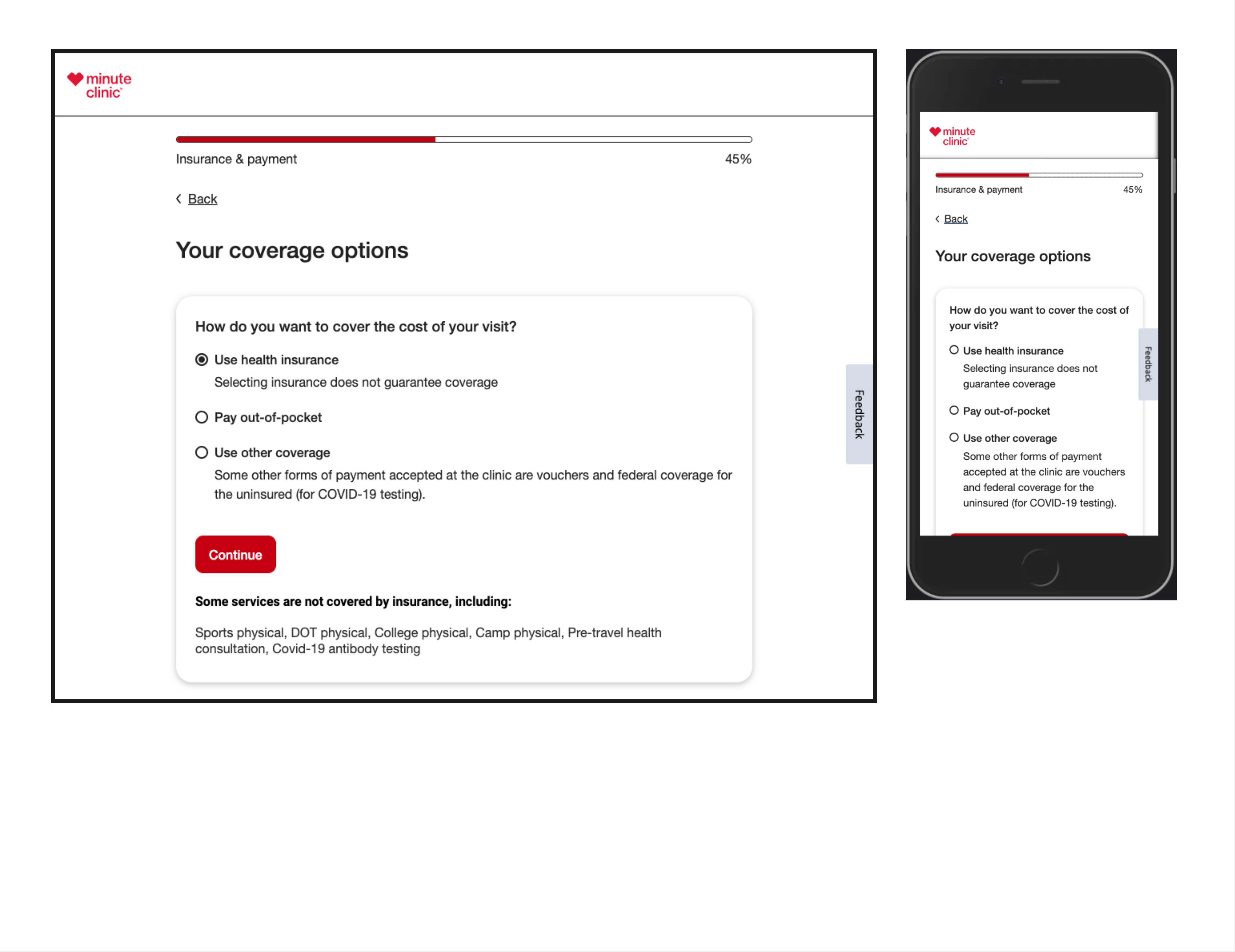
Select Coverage & Insurance

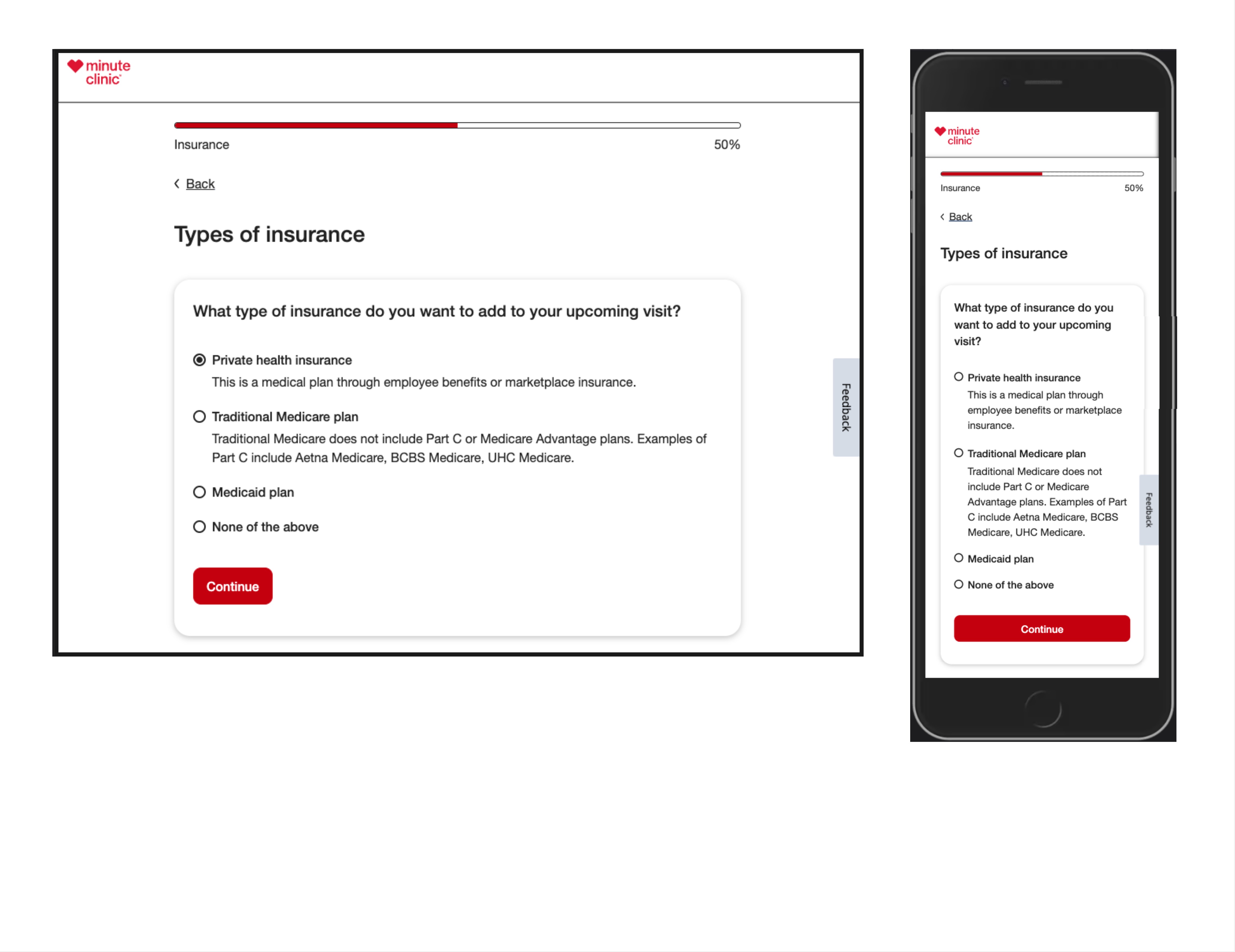

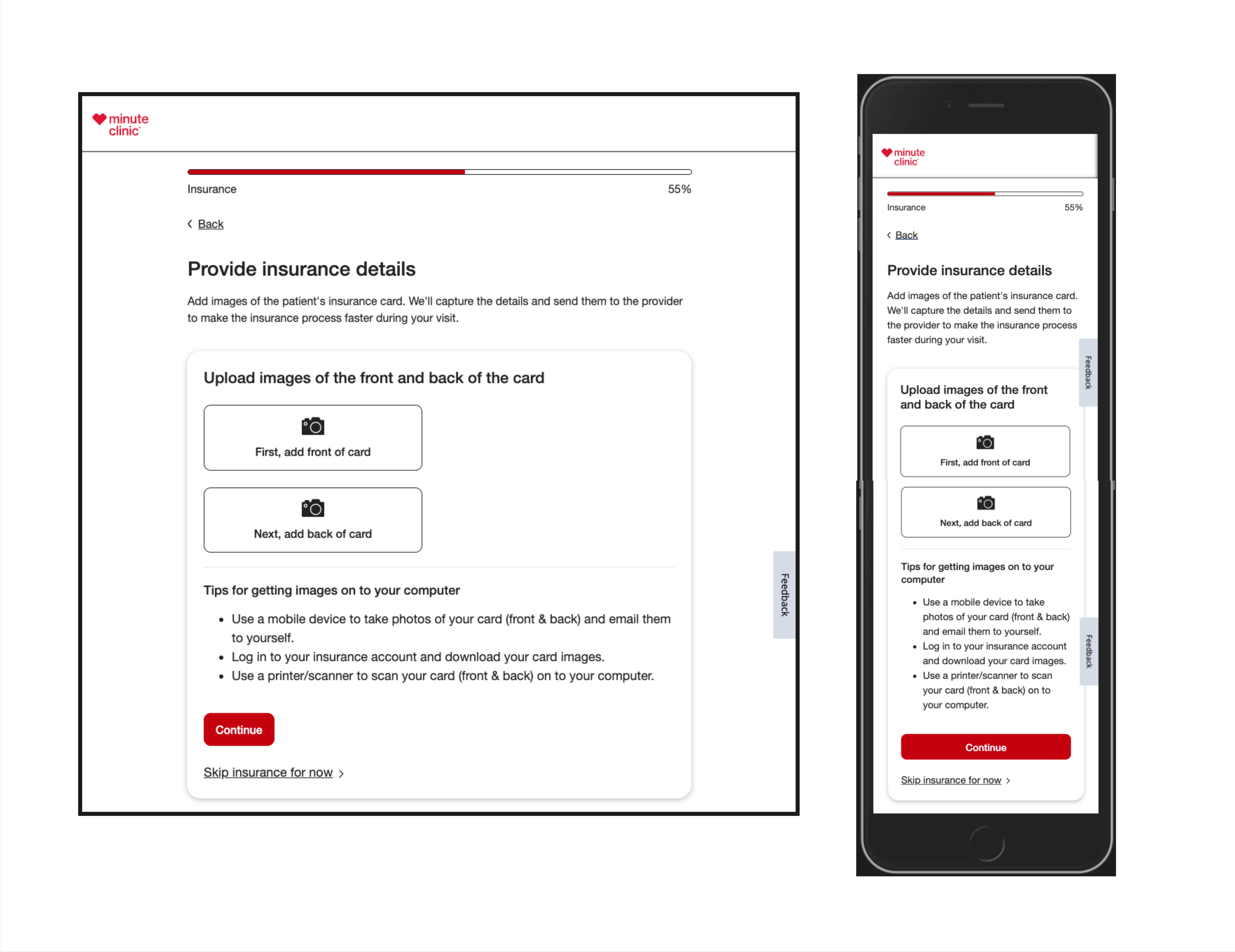
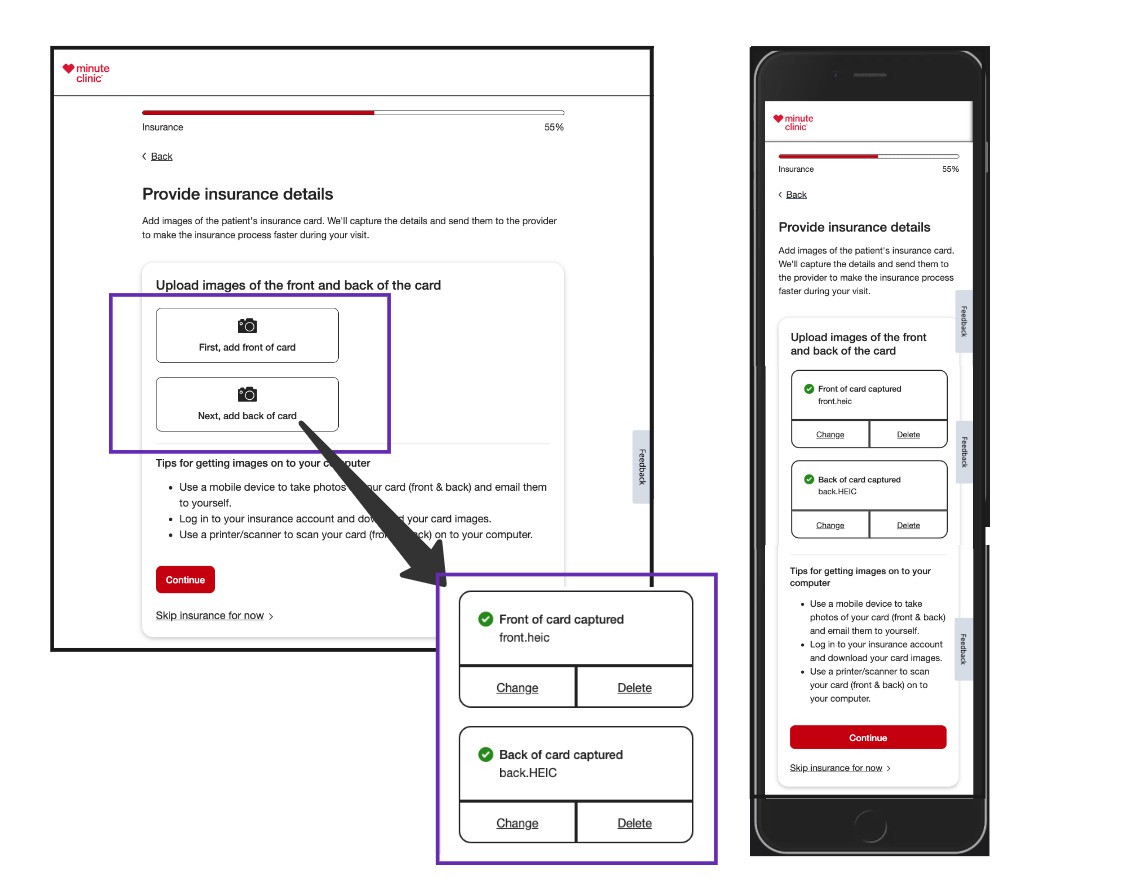
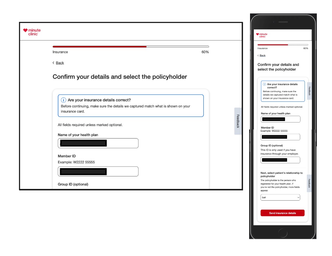
Adding Insurance Details


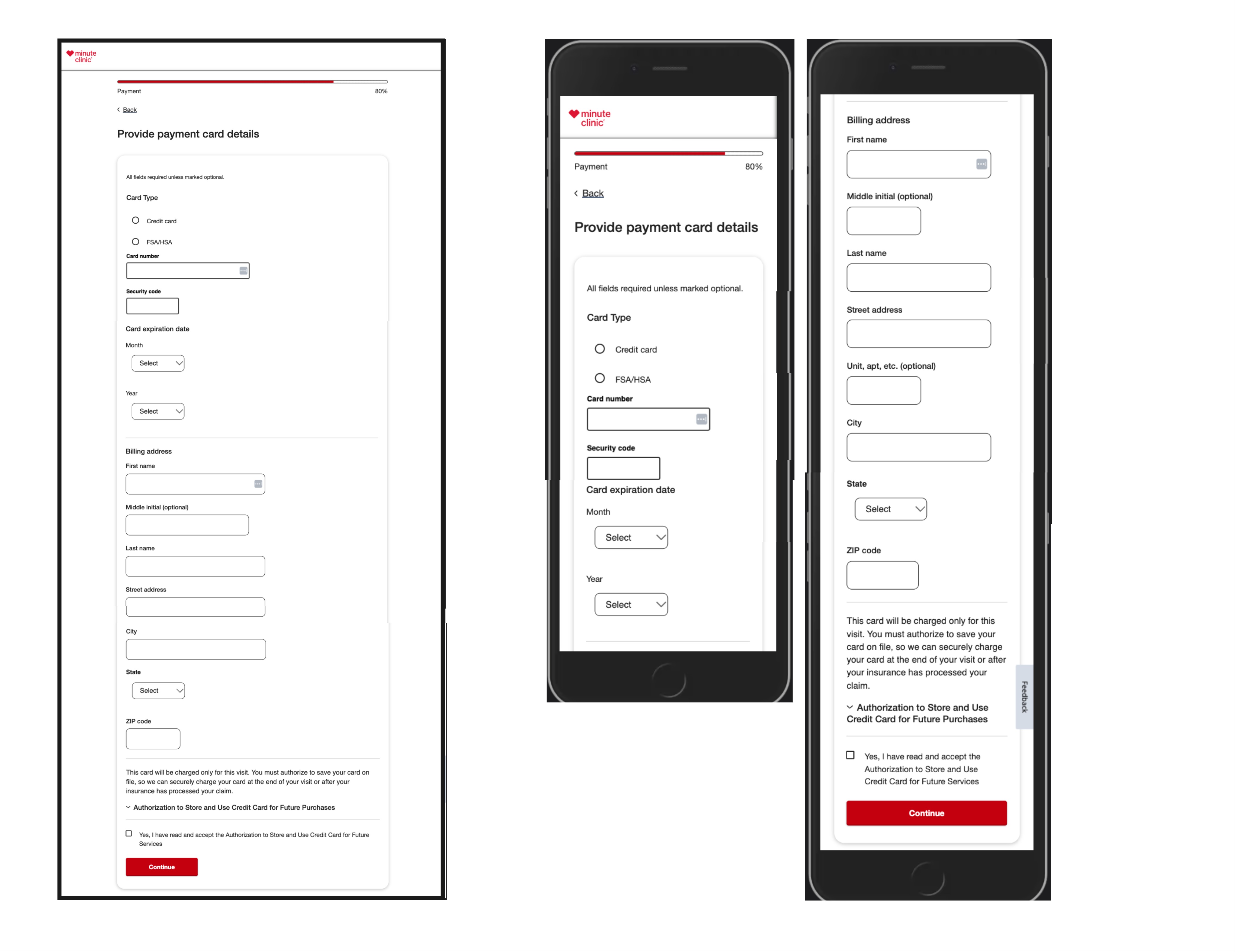
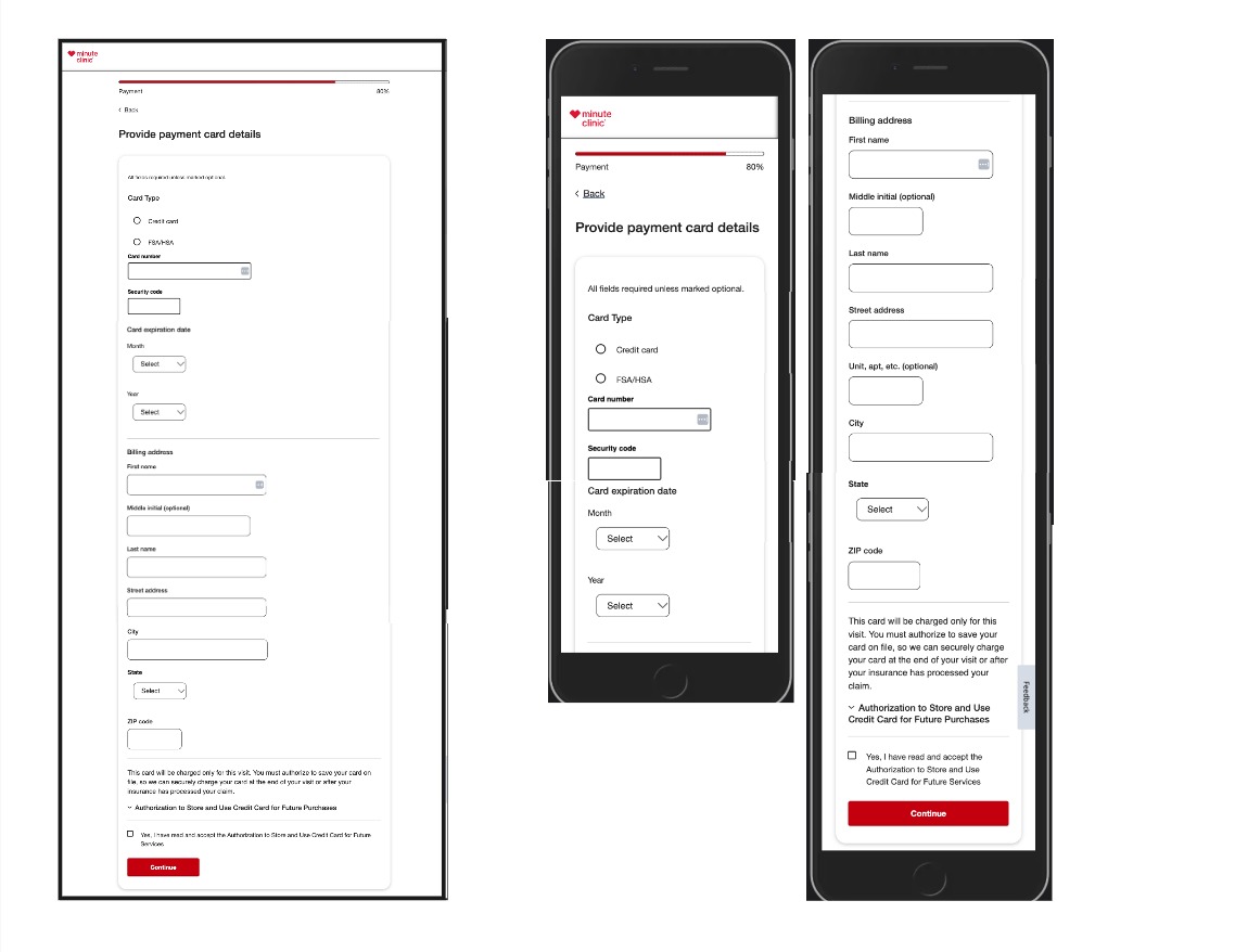
Add Payment Card
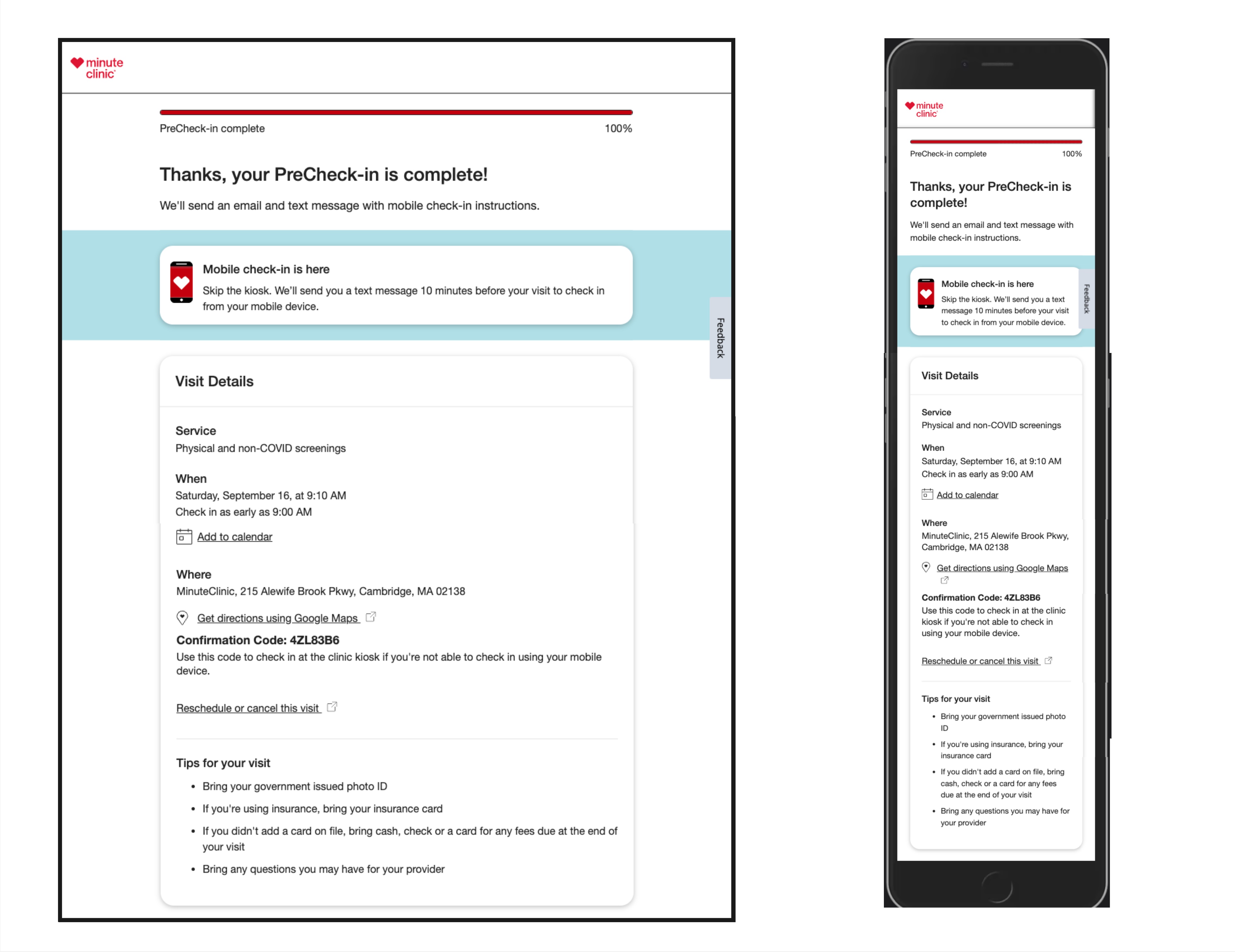
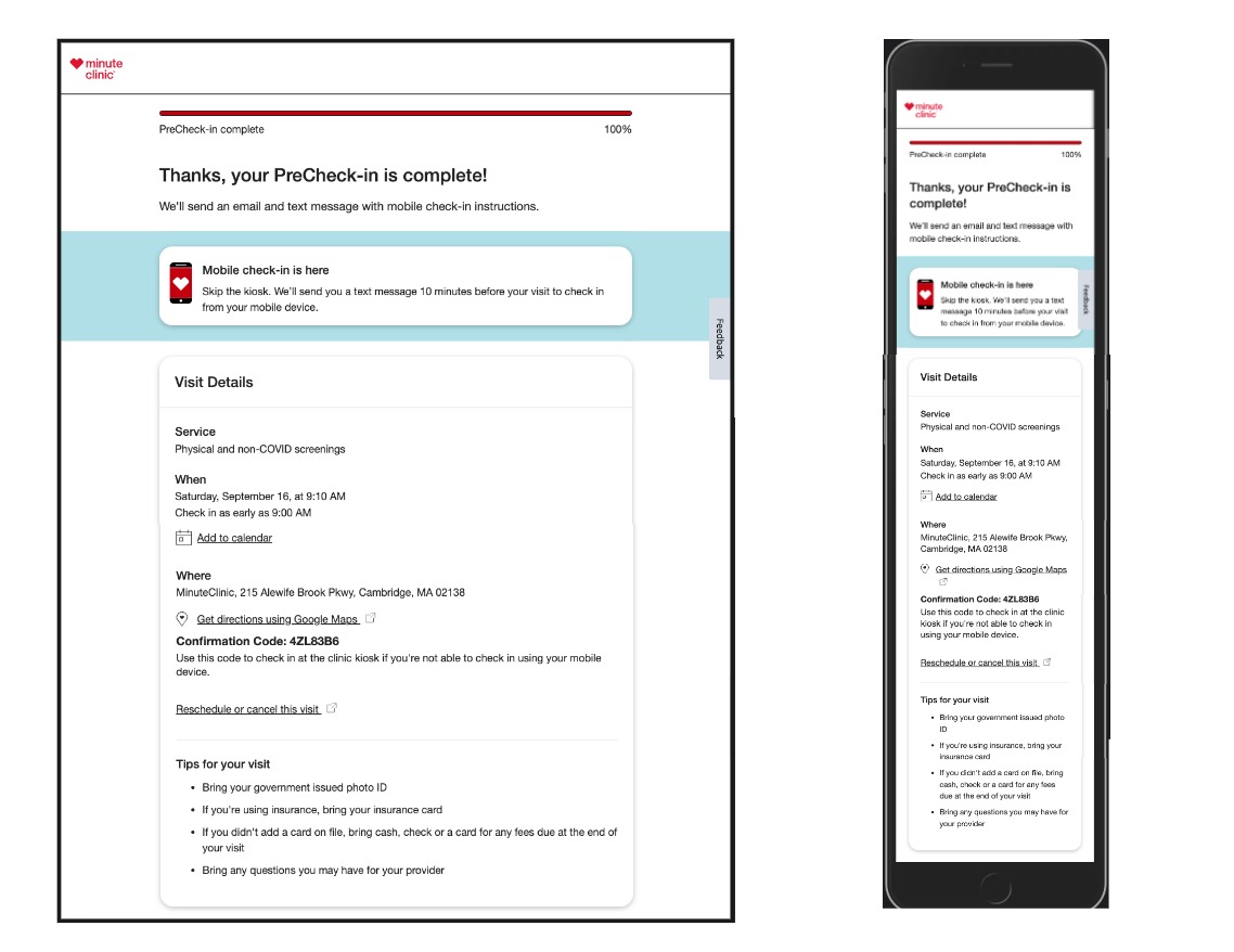
Precheckin Complete
Retrospective
Closing thoughts and Accessibility Recommendations regarding project next steps and ways to enhance and support more users.
- Embrace Magnification Users by updating Progress Bar Element. The Application could embrace low vision and screen magnification users by aligning critical information more on right side of the screen. The Progress bar percentage information hangs far right in the current design. Magnification users reported not being aware or identify element as a progress bar or aware of its changing without excessive scrolling. A11y recommendation move percentage information to left with other progress label.
- Insurance Collection: multi means of Input data.The current flow only supports the collection of insurance with images of insurance cards. While users can skip providing insurance without an image file or taking a photo. Some users might not have insurance card handy, a working camera or the ability to easily take photos of an insurance card. Experience could support those with hand/arm mobility, low or no vision by allowing insurance data by text-filed inputs.
- Insurance Collection: Users with Learning or Cognitive differences by design with consistent placement Actions in Layout. The 'Skip insurance for now.' Actions was placed after the main Call To Action button which is usually the last element found on the page. Users reported missing such actions and felt would have helped them if they had knew about the option. Consistent Layout design can in particular help users with Cognitive or Learning related differences.